Enterprise AI
B2B Logistics
2025
AI Dispatch Manager Replacing a 5-tab, phone-call-heavy dispatch workflow with a conversational AI interface — five specialised agents that take a logistics coordinator from order to transporter in one thread.

Scroll to explore
My Role
End-to-End Product Design
Domain
Enterprise Logistics SaaS
Timeline
Concept phase
Team
1 Designers, PM, 2 Engineers
Platform
Web · Desktop-first
Tools
Figma, Google Doc, Figjam
After nearly three years designing Fretron's TMS platform, a pattern kept surfacing in user research: dispatchers were spending most of their shift navigating between tabs and making calls - not making decisions. For a managerial-level user, that meant starting the day by opening the orders module, filtering for dispatch-ready orders, assigning a load, switching to the indent module, reviewing it, moving to auction, waiting for allocation, then finally confirming shipment. And that's on a clean day with no exceptions.

1
The industry shift toward AI-integrated SaaS
2
Hearing consistent friction from clients - late responses, too much human coordination overhead.
3
Alignment gaps between teams which results in loss of a potential client
4
For a managerial-level user, who has less time and more work to do
Two interviews and a lot of existing data.
I ran two user interviews - a dispatch manager and a supervisor - and pulled from existing usage patterns in the product. I also spent time studying how AI chatbots in the market were actually structured: how they surfaced reasoning, how they handled uncertainty, how they kept experienced users from feeling talked down to.

02 — Impact
10s
Typical response time for an order query - down from 60+ seconds of manual filtering
50%
Increase in task completion efficiency measured in internal A/B testing
2
Surfaces tested - AI chat vs. dashboard - with users preferring the integrated AI approach
1mo
From first sketch to client demo - prototype tested with a real user before the meeting
1
Platform from dispatching orders to allocating transporters.
The AI chatbot feels the same as other AI native chatbots. Used similar layouts and UX logic for creating this.
Full platform designed end-to-end from Order dispatch, Load panning to complete allocation system
The typography, color and brand guidelines is also integrated in reference to the existing product
Solo designer working directly with the PM. Brand identity, UX flows, and all 20+ screens are direct design contributions.
03 — My Contribution
1
Research
User flow definition
Pain point mapping
Key Insight
The core finding from research: dispatch coordination is a linear workflow disguised as a multi-system task. The picture that emerged wasn't a technology problem - it was a workflow architecture problem
2
User flows
Wireframing
Flow mapping
Structured the entire platform across five agents (Dispatch Order Agent, Load/Route Agent, Indent Review Agent, Transporter Auction Agent,Transporter Communication Agent) with a Conversational intelligence on top of data dashboard . Created wireframes for 20+ screens covering order journey, Query Journey, Order dispatch, Overview, and logistics management.
Why Agents?
The question wasn't "how do we improve the existing interface." It was "what if the interface worked the way dispatch coordination actually works?". That is the raeson i choose agents over any dashboard
3
Color palette
Typography
Style guide
High-fidelity screens
Designed the complete brand system from scratch - Claen Interface with clearspace and minimum size rules, primary color palette , typography system, layout, and Element direction.
How is it Useful?
The AI chatbot feels like another AI tool used by a person as the user is familiar with other tools. So All the visual identity has been given in resepcet of that Theory.
4
Figma handoff
Component specs
Working Prototype
Delivered organized Figma files with screen-by-screen annotations, component documentation, and a working prototype. Structured for developer clarity across all platform sections.
Result
It gives us good outcomes as users can now easily and efficiently get their task done. Although It is just the initial phase but the response is good.
04 — Key Design Decisions
Three decisions. Each one observed.
Decision 01
The "Behind the Response" transparency panel
Enterprise users - especially in logistics are accountable for every action the system takes on their behalf. A coordinator who approves a load plan and it goes wrong needs to be able to explain exactly what the system did and why. That's not a UX preference, it's an operational requirement. Every AI response in the interface includes a collapsible "Behind the response" panel. It shows the exact steps the agent took: what it fetched, what criteria it applied, what it searched for. The user doesn't have to open it but it's always there.
Rejected
A clean output with no process visibility - just the result. Simpler, faster. Rejected because it creates an accountability gap. When an audit happens, "the AI did it" is not a valid answer for an operations manager.
Chosen
Collapsible process transparency by default. The primary view stays clean - you see the output. But one click gives you the complete reasoning trail. This matches how senior coordinators actually work: they want the summary, but they need to know the detail is there.

Decision 02
The AI escalation pattern: doing what it can, flagging what it can't
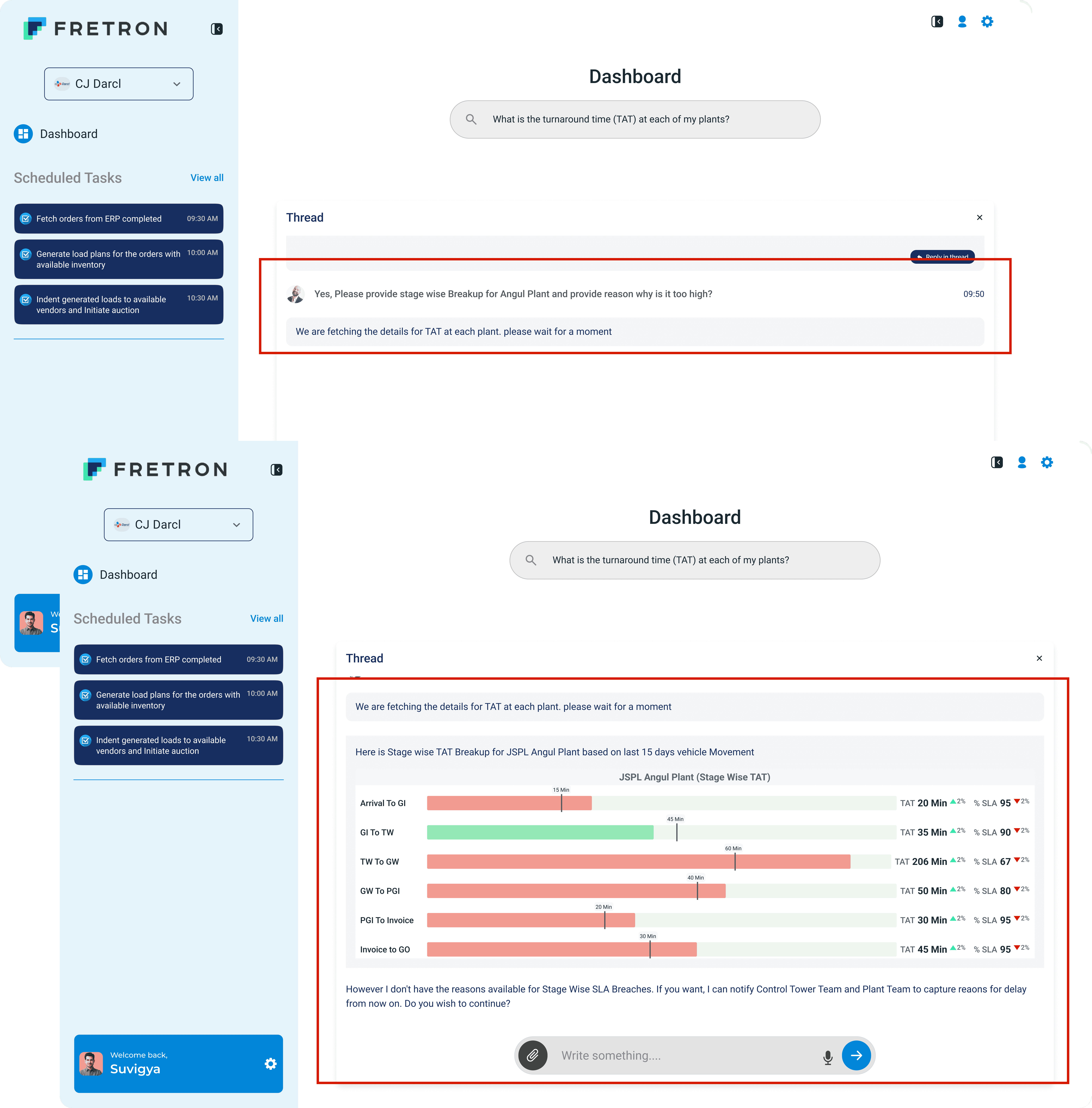
This was the most important design decision in the entire project. In the Dashboard TAT conversation flow, when a user asks "Why is Angul's TAT so high?", the agent gives the stage-wise breakdown - and then says: "I don't have the reasons available for Stage Wise SLA Breaches. If you want, I can notify the Control Tower Team and Plant Team to capture reasons from now on." That response pattern - answer what you know, acknowledge what you don't, offer a path forward - was not accidental. It came from observing what happened when systems gave confident wrong answers: coordinators stopped trusting them entirely.
Chosen
Honest capability boundaries with proactive escalation offers. The agent knows what data it has and what it doesn't. When it can't answer, it says so — and immediately offers to fix the gap. This builds the kind of trust that makes a user willing to give the system more authority over time.
Decision 03
Reply in Thread: deep dives without losing the primary flow
Coordinators need to act on a result and also investigate it. "Show me all orders scheduled for today" generates a list. But "tell me more about order #ORD3003703971" shouldn't replace that list - it should extend it. The thread model collapses if a drill-down takes over the primary conversation. Reply in Thread opens a sidebar thread for specific result exploration. The user can get full order details - consignor, consignee, material, vehicle type, freight cost, pick/drop location - without losing their place in the primary dispatch flow.
Rejected
Full-page drill-down views - navigating to a separate screen for order details. The existing TMS pattern. Rejected because it breaks the conversational flow and reintroduces the context-switching problem the interface was designed to solve.
Chosen
Sidebar thread model - same pattern as Slack threads. The primary flow stays intact. Deep dives happen in context. And when the user is done, they're exactly where they left off in the primary dispatch workflow.

05 — Final Design
Five Agents Along with a Dashboard
Dispatch Order Agent
Load/Route Agent
Indent Review Agent
Transporter Auction Agent
Transporter Communication Agent
The Dashboard
Flow-1
The flow shows how the user ask the agents to work by giving one simple prompt. It will show how the orders who are ready for dispatch can go to transporters without any other person involvement.
01

Flow 02
New Thread journey
In this flow you will see how can a user continue his coverstaion side by side with the actual conversation. It will save his time and effort if he wants to go deep in any coversation
02
Flow-3
The Dashboard
The dashboard wasn't designed as a static summary view. It was designed as the starting point for conversations and as the destination for things the AI configured on your behalf. The TAT conversation in the prototype shows this clearly
03
06-Reflection
1
What worked
The Agents
The agent architecture. Research consistently showed dispatch coordination as a sequential, goal-driven workflow - not exploratory. The conversational model matches that mental model in a way a dashboard doesn't.
Separate interfaces.
The decision to keep the dashboard and the agent interface separate. There was a point mid-project where the temptation was to unify everything - one surface, one entry point. The user interviews pushed back on that instinct.
The transparency panel
Enterprise users need accountability trails. "Behind the response" solves this without cluttering the primary interface.
2
What I'd change
More Deep Research and Insights
I'd spend more time on the agent configuration experience earlier in the process. I descoped it to a single demo screen, which was the right call for the timeline - but it's the part of the product that determines whether the agents actually work well for a given client's operations. Load sequencing logic, TAT targets, escalation rules - these are all set there. Treating it as a secondary screen in the demo undersold how central it is to the system. I'd prototype it more completely in the next phase.
3
What I learned
Enterprise users distrust
Enterprise users don't distrust AI because it's unfamiliar. They distrust it because they've been burned by systems that gave confident answers to the wrong questions. The "Behind the response" panel wasn't a transparency feature for its own sake - it was a trust repair mechanism.
Real-world testing
Whether coordinators would trust the agent's transporter suggestions, or always override them. SOB-based allocation is rule-governed - but humans have relationships. That tension needed real-world testing.