● LIVE INTELLIGENCE
B2B Enterprise
2025
Replacing weekly Excel reports with live logistics intelligence — unifying operations, delivery, billing, and compliance into a single decision-making view for JSPL's plant logistics heads.

Scroll to explore
My Role
End-to-End Product Design
Client
JSPL — Jindal Steel & Power
Timeline
3 Months
Team
1 Designer · 3 Engineers · 1 PM
Platform
Web (Desktop-first)
Tools
Figma · FigJam · Miro Figma · Google docs
JSPL's logistics operations spanned dispatch, delivery, billing, and compliance — each tracked separately, reported weekly, and siloed from the others. When one domain slipped, it triggered failures across all the others. But because reporting was weekly, managers only discovered cascading problems after they had already compounded.

Reactive Decisions
Managers acted on last week's data — problems had already compounded.
Disconnected Data
Operations, billing, and compliance lived in four separate systems.
Stale Reporting
Weekly Excel exports meant no visibility between Monday reports.
No Vendor Accountability
Transporter performance tracked anecdotally — no OTIF baseline.
By the time the Excel report lands on my desk, the problems I'm reading about are already a week old. There's nothing I can do about them.
We'd argue with transporters based on gut feel. We had no data to show them why they were underperforming or by how much.

02 — Impact
60%
more data-driven
30 Min
Detect Breaches
1 Day
Real -Time update
1 View
for Quick Glance
One
System
Logistics heads now see live data instead of waiting seven days for a report.
Status checks that required three phone calls now take a single dashboard scan.
SLA breach alerts surface before the deadline — not hours after the miss.
These are qualitative shifts measured through stakeholder interviews and usage analytics 60 days post-launch. Quantitative baselines were not available pre-launch — the Excel era had no tracking infrastructure.
In use at 3 JSPL plants
03 — My Contribution
1
Stakeholder Interviews
Workflow mapping
Data Audit
01
2
IA
KPI Hierarchy
Domain Mapping
Defined the dashboard's three-pillar structure — operations, customer service, and compliance — and the KPI hierarchy within each. Mapped which metrics needed to sit together to make cross-domain relationships visible.
02
3
Chart Design
High-Fidelity UI
Figma
Visual Hierarchy
Made deliberate visualisation choices for each data type — donut charts for cross-pillar comparison, bar charts with SLA benchmark markers for bottleneck detection, and a clean sortable table for transporter rankings
03
4
Spec Handoff
Sprint Collaboration
Stakeholder Feedback
Delivered detailed specs to 3 engineers, collaborated across sprints to resolve data latency and charting edge cases. Post-launch, tracked adoption through Mixpanel and ran stakeholder interviews at 60 days to validate qualitative shifts
04
04 — Key Design Decisions
Decision 01
One unified view, not three separate tabs.
Logistics heads think in interconnected systems — a delivery delay affects billing, which affects compliance. Separate dashboards force them to mentally stitch that picture. A single unified view lets the cross-domain relationship become visible at a glance. The anchor decision everything else was designed around.
Rejected
3 tab-separated views
Shipped
Single command-center view

Decision 02
Spot the bottleneck before reading a number.
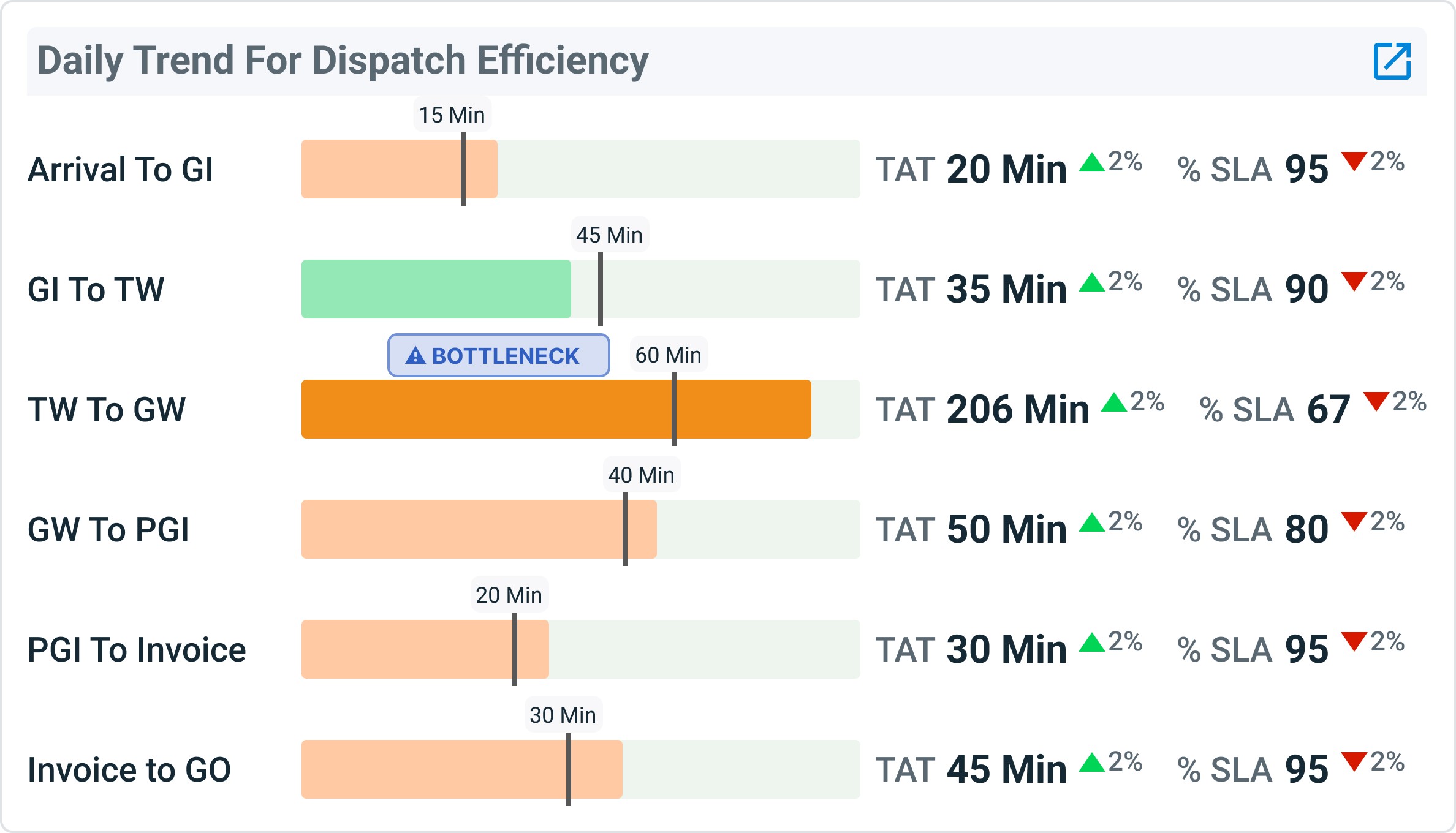
The TAT chart shows time spent in each plant stage with a fixed SLA marker. The bar length makes overruns visible before any number is read. TW-to-GW at 206 minutes (2.3× over SLA) is the single most impactful bottleneck — and it jumps out without tooltip or annotation.
Shipped
Design principle
Decision 03
Donuts over dense stats — audience-first reasoning.
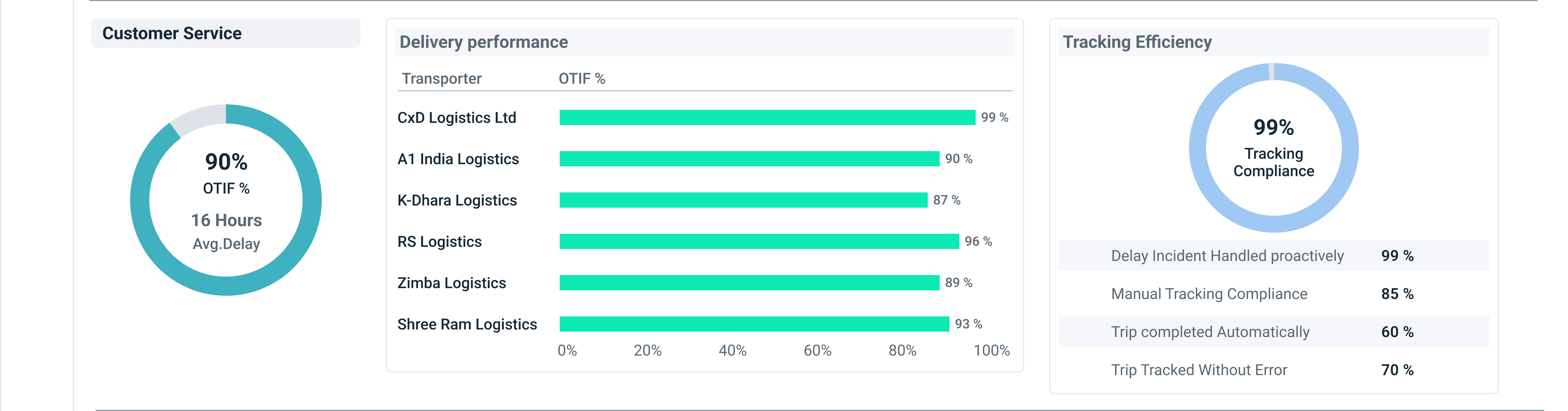
For experienced operators checking status multiple times a day, relative visual scale matters more than precise digits. Donut charts let you compare three pillars in a glance. A dense number list requires reading every row and holding all three in working memory.
Rejected
Pre-attentive visual cues over cognitive number parsing. The chart does the comparison work.
Conscious tradeoff
Donuts sacrifice precision for pattern recognition — the right call for a status overview panel that analysts never use as their primary tool.

05 — Final Design
Screen 01
TAT breakdown by sub-stage with SLA benchmarks — designed to surface the bottleneck before the manager reads a number.
01

Screen 02
Customer Service & Vendor Performance
OTIF overview with a clean transporter ranking table — the screen that changed how vendor reviews are run.
02
Screen 03
Billing & Compliance
Self-billing rate, pending invoices, and a violation breakdown — turning audit prep from a week-long exercise into a glance.
03
