● LIVE TRACKING
LOGISTICS · B2B SaaS
2025
Real-time vehicle tracking for logistics plant managers - replacing manual Excel and phone coordination with a live map-based interface that delivered 42% faster turnaround.

Scroll to explore
My Role
End-to-End Product Design
Timeline
3 months
Team
1 Designer · 2 Engineers · 1 PM
Platform
Web (Desktop-first)
Tools
Figma · FigJam · Miro · Google doc
Status
Shipped · In Production
Plant managers coordinated 15-20 vehicles daily using Excel sheets, phone calls, and paper gate registers. If a truck had been sitting in the wrong zone for two hours, nobody knew until someone physically walked out and checked. Every decision about resource allocation, bay assignment, and dispatch sequence was based on information that was already wrong.

From co-ordinators to plant managers to Plant heads everyone was dependent on each other. This leads to the blind spot where no one knows about the vehicles although they are in factory.
Blind Coordination
No one knew where vehicles were without making phone calls.
Wrong Placement
Trucks waited at wrong bays due to outdated pen-and-paper records.
Delayed Dispatch
Manual gate-entry processes added 20–40 mins per vehicle cycle.
SLA Breaches
No proactive alerts - managers only knew of breaches after the fact.
I interviewed plant operations managers, logistics managers, and system administrators to understand how vehicles actually move through a plant - from entry to exit. The key insight wasn't just that they couldn't track vehicles. It was that the lack of visibility created a chain reaction: wrong vehicle placement led to crowded zones, which led to delayed dispatch, which led to SLA breaches, which led to cost overruns. Every problem fed into the next
"I spend half my day just calling drivers to find out where they are. By the time I get an answer, the situation has already changed". This type of response i got when i talk to one of managers of plant.
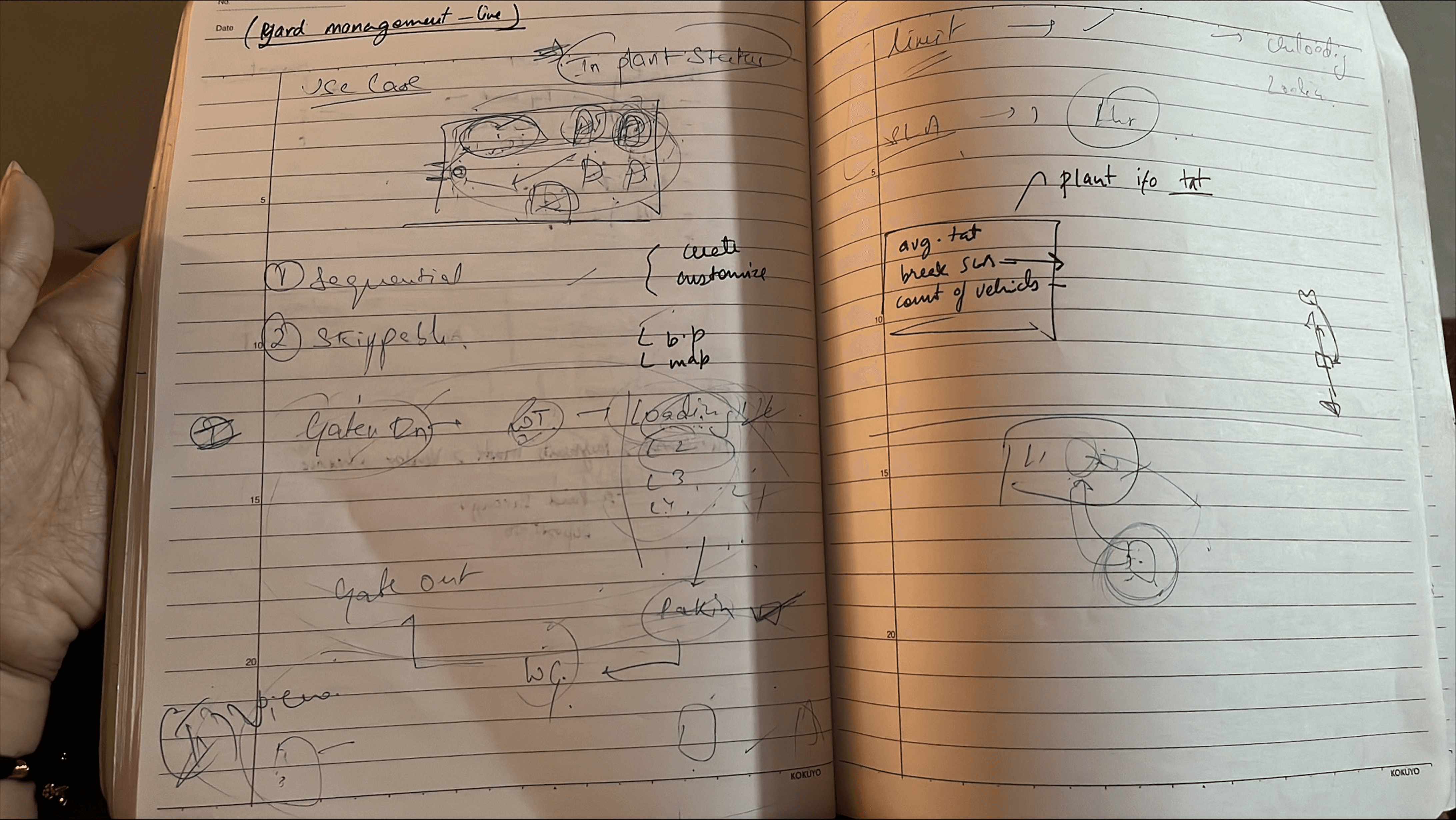
02 — Impact
75%
Fewer manager-to-driver coordination calls per shift significantly
30%
Better yard space efficiency with correct bay assignment from the start
42%
Reduction in average vehicle turnaround time (90min ->52 min)
60%
Reduction in SLA breaches monthly with proactive alerts surfaced problems early.
40%
Less idle time in critical zones. Vehicles stopped sitting in the wrong places
0
Navigation steps to reach an SLA alert. vehicle ID, driver contact, breach duration in minutes - surfaces on the map without any navigation.
90%
Efficiency in category identification with colour system in a plant with 80-90 active vehicles
3
Signals managers get without a dasboard with the help of stage cards. Avg TAT, break SLA count, vehicle count.
Measured across 3 operational plants over a 60-day post-launch period. End-to-end owned — from discovery through delivery and iteration.
Live in production
03 — My Contribution
1
User Research
Workflow Audit
Stakeholder Interview
The Finding
The finding that changed the design direction: plant managers don't think in rows - they think in space. Every manager I interviewed described their plant in physical terms: 'Zone B is always crowded by 11am,' 'the loading bay on the left runs slow.' They already had a mental map. The interface needed to match it, not replace it with a spreadsheet.
2
IA
User Flows
Spatial Interface Design
Defined the information hierarchy for a spatial interface: map as primary view, vehicle marker system, alert priority logic, and the journey timeline. The core structural question was what a plant manager needs to see at a glance versus what they need to click into.
At a glance
Where is every vehicle right now, what is its status, is anything going wrong. On click: full journey timeline, stage history, material details, reassignment options. The two-layer structure kept the primary view scannable during a busy shift without hiding the detail that managers needed for specific decisions.
3
High-Fidelity Design
Prototyping
Figma
Final Design
Designed all production screens end-to-end: live plant overview, vehicle tracking and staging detail, alert and SLA monitoring panel. Built interactive prototypes for each major flow for stakeholder review before moving to high-fidelity.
V1 failure
the first version of the map used the same visual treatment for every vehicle - same colour markers regardless of type or status. In a plant with 30+ vehicles across multiple zones, the map was visually flat. You could see where vehicles were but not what they were or whether they needed attention. The PM flagged it after reviewing high-fidelity designs. I introduced a 4-category colour system - different colours for vehicle type and load status, with empty and loaded counts visible in the category panel. Scanning the map for a critical state dropped from reading each label to under a second.
4
QA Alignment
Sprint Collaboration
Post-Launch Iteration
Delivered detailed specs and collaborated with 2 engineers across sprints. Ran post-launch reviews using production data from the 3 plants.
One post-launch finding
supervisors on the plant floor weren't at desktops during shifts - they were walking the yard. The desktop-first system gave plant managers in the control room full visibility, but the people closest to the vehicles had none. Mobile responsiveness was not in the original scope. It should have been.
04 — Key Design Decisions
Three decisions. Each one a response to something observed.
Decision 01
Map-first, not table-first
My first instinct was a table. It's the standard pattern for tracking entities in enterprise software. After spending time in interviews understanding how managers actually work, I saw the problem with a table: it forces a cognitive translation step that the map eliminates. A manager reading 'Vehicle 4523 - Zone C - 47 minutes - Empty' has to picture where Zone C is relative to the loading bays and decide whether 47 minutes is a problem for that zone. That mental translation happens under time pressure, across 15-20 vehicles, dozens of times a shift
What I rejected
keeping the table as the primary view with a map as supplementary. This was the safer option - most of the PM's mental model of the product was built around table-based interfaces from TMS. Rejected because it would have required managers to toggle to the map every time they needed a spatial read, which is constantly. The table stayed as a secondary filter for detailed sorting and export - it's the right tool for that task. It's the wrong tool for the primary one.
What I rejected
A map eliminates the translation. Overcrowded zones are visible. Idle vehicles stand out. The spatial relationship between vehicles and zones communicates the problem without reading a row


Decision 02
Status and location, not just location
The first version of the marker system showed vehicle position. Nothing else. Knowing a vehicle is in Zone B tells you where it is. It tells you nothing actionable. What managers needed to know at a glance: what stage is this vehicle in, is it loaded or empty, and how long has it been here. Three signals. Each one changes what action is required. A loaded vehicle that has been in staging for 90 minutes is a different problem from an empty vehicle in the same zone for the same time.
What I rejected
showing only location with full detail on click. Cleaner map, lower visual density. Rejected because the primary use case is scanning - a manager checking the plant state during a busy shift doesn't have time to click every vehicle that looks potentially delayed. The signals need to be visible at the overview level. Click-through is for confirmation, not discovery
Decision 03
Colour as a scanning system, not decoration
V1 shipped with monochrome markers. The PM flagged it in the sprint review: managers couldn't distinguish vehicle types or status categories at a glance. In a plant with 30+ vehicles, scanning for a delayed vehicle meant reading each marker label individually. The fix was a 4-category colour system: one colour per vehicle status category, consistent across the map and the category panel. A manager can now identify a Delayed vehicle in under a second - not after reading each label, not after filtering a table
What I rejected
A status filter approach - show all vehicles in one colour, let managers filter by category to highlight the ones they care about. Simpler system, less visual noise. Rejected because filtering requires knowing what you're looking for. A plant manager during a shift needs to see what needs attention without first deciding what category to look for. Colour surfaces the answer before the question is formed.
Key Insight
The iteration came from the PM feedback loop, not from a second round of user testing. This was the right call given the 3-month timeline. It's also the thing I'd validate with users earlier if the project ran longer.

05 — Final Design
Screen 01
Primary interface. A spatial map of the plant layout with every vehicle plotted in real time. Colour-coded markers show vehicle type and status. Overcrowded zones are visible at a glance. Hovering on any vehicle shows its current stage, load status, and time in zone without clicking through.
01

The Stages and Categories cards showing the no.of vehicles.
It helps users to view all the vehicles in-plant movements along with the material they have and the exact place where vehicles are standing right now.
Average TAT and SLA Breach can be shown along with the Vehicles
It will help the plant heads and supervisors to monitor where the extra time is going and which vehicles are breaching most of the SLA rules
Color Categories with inherited map
It helps users to differentiate between the categories and also locating them on the map parallely.
Designing for Visibility - not just tracking
The whole plant management system was designed for maintaining the visibility of vehicle s in the plant not just tracking them but also giving the whole scenario of tracking which includes location , stage, material, driver, status of vehicles. It helps the supervisors to understand better about the whole process in the plant vand then manage the loopholes accordingly.
Screen 02
Vehicle Tracking & Staging with Alerts & SLA Monitoring
Full journey timeline for any vehicle - from gate entry to dispatch, with current location and SLA status at a glance. Proactive alerts surfaced before SLAs breach - with map highlights to make the affected vehicle immediately findable
02

Screen 03
Plant Summary View
The summary view- it shows the workflow of the vehicles stage-wise and category wise and also shows the Inside and Outside vehicles of plant.
03

06-Reflection
1
What worked
Map-first decision
The map-first decision held. Post-launch, managers were using the spatial overview as their primary coordination tool - exactly as designed. The shift from phone-call-based coordination to screen-based coordination happened faster than the PM expected. Coordination calls dropped 75% in the first 60 days.
Colour iteration loop
The colour iteration loop worked. V1 monochrome markers were the right thing to ship because the feedback it generated was specific and actionable. A filter-based approach might have passed design review without exposing the scanning problem. Shipping the simpler version first and iterating on real feedback was faster than trying to solve it in theory
Summary views
The summary views also gives the clarity i want to give as a designer. The feedback that comes after launch was that it is not entirely focused on map but there is summary also which can help a lot of users who didn't recognise the map view. Basically it served 40% more effectiveness with map.
2
What I'd change
More deep research and mobile responsiveness
I'd push to visit a plant in person during the research phase. I interviewed managers and mapped the vehicle lifecycle, but I didn't see a busy shift in person. The spatial design decisions came from what managers described, not from what I watched. Some of the colour and marker decisions would have been sharper with firsthand observation of how fast managers actually scan the plant during peak hours. Mobile responsiveness should have been in the original scope. Plant supervisors are on the floor during shifts, not at desktops. The people closest to the vehicles had no access to the system at all. A mobile-optimised map view would have extended the system's value to the person who most needed it.
3
What this project taught me
Different design logics exist
Spatial interfaces have different design logic than form-based enterprise software. The questions are different. Not 'how do I display this data clearly' but 'what does a manager need to see in three seconds at 11am when the plant is at peak capacity.' That's a faster, higher-stakes read than most enterprise design problems assume.
Adopting the system
The managers who were fastest to adopt the system were the ones whose mental model of the plant was already spatial. They weren't learning a new interface. They were getting a digital version of the map they already carried in their head. Designing to match an existing mental model is a different challenge from designing to build a new one.